Well, i finally got round to writing this. Better late than never etc.
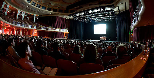
I really felt like I needed to put something up on the conference, because this year’s felt like a completely new level. We had cool video intros, cooler hotel room interiors, slick evening inspired sessions and a pub venue for the first night’s mixer that didn’t completely suck! Plus the usual dome theatre venue which is a beautiful space in which to soak up the collective knowledge of what was a stellar speaker lineup.
I really tried hard to prepare a lot of my talk in advance this time, but as usual, many things were left undone (despite a frantic code marathon on the train journey down) so a fair amount of the initial stages of the conference were spent inside a hotel room. This was in part thanks to the new version of Away3d released the day before, the usual frightening emails reporting errors started coming through a few hours after i arrived in brighton which didn’t help my composure or coffee consumption. If I came across as a little wired on the first day… now you know why!
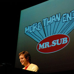
But enough of that – what of the conference? There were a few special highlights for me – the first being James Paterson talking about, well, himself, on the first day’s ‘inspired’ session. James delivered the entire presentation as someone might their holiday snaps, adding an extra level of surrealism to the proceedings. I especially liked the Mr. Sub commercials, not just for their content but in the gleeful way James described the horrified reaction of the company execs after receiving the first two shorts. I’m delighted to say the entire series of commercials can be found on Youtube if you feel like reliving the lunacy. Another big hit for me was the sonic wire sculpture (actually the work of his occasional co-conspirator Amit Pitaru) and a very interesting looking 3d drawing tool called Rhonda that James had used in his usual style to draw hundred of characters with varying degrees of boob appendages. Like i said, inspirational.
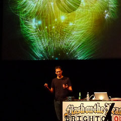
The second standout presentation for me had to be The Robert Hodgin and his Magnetoshpere demos ITunes 8.0 visualiser. Congrats are in order, but Robert being the modest kind of guy that he is almost seemed embarassed by this recent success. Although he did add a small tribute to Steve Jobs in his ‘people who inspire me’ section, which was a nice touch.
The demos on offer here were part of a large back catalog built up over the years, and do seem to nicely illustrate the point Robert often makes about his work – if you do the same thing for long enough you will get good at it ![]() . His latest visuals are something quite different it seems, being a collaborative effort for a music festival whose names escapes me, assisted by a hardcore 3d coder friend of his whose name also escapes me. I should really try to write this down in future. Anyway, the results looked fantastic, and i’m sure will feature on Roberts blog flight404 very soon.
. His latest visuals are something quite different it seems, being a collaborative effort for a music festival whose names escapes me, assisted by a hardcore 3d coder friend of his whose name also escapes me. I should really try to write this down in future. Anyway, the results looked fantastic, and i’m sure will feature on Roberts blog flight404 very soon.
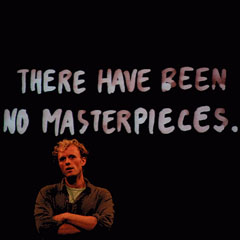
Finally I have to say something about the closing presentation of the conference by Johnathan Harris, partly because because it has generated so much reaction already, much of it negative. Johnathan managed 90% of his talk with the calm measured and highly effective approach seen in many of his past works – including Wordcount, 10×10, We Feel Fine and The Whalehunt. All of Jonathan’s work seems to incorporate some deeper analysis to a collection of data that occasionally reveals unexpected results, while maintaining a human connection to the subject matter. Clever stuff I have to admit.
However, that last 10% of the presentation was where all the trouble started. Johnathan seems to be labouring under the misapprehension that designers and coders are all empathic artists who have just lost their way. Wrong. A typical web creative is someone who does what they do because they enjoy it. There is no drive to create masterpieces, which is why none are being created.
I guess Jonathan’s point was really to try and address this situation – try to encourage thinking on a grander scale. However, it may still be a little too soon for this – these days the majority of creatives at the most senior level of web companies (and therefore the ones with the power to take a different direction with their work) are the ones who were part of the whole dot com boom of the mid-nineties. Is anyone really trying to suggest that these people need to have their inner artist cajoled out of them? He might as well have delivered his speech to a room full of bankers. Rather than encouraging deeper thought, Johnathan has inspired an endless discussion on how he came across as someone who is out of touch with what it means to work in the web industry today.
So to end, I suppose I should mention a little of my own presentation and how it went. The majority of content showcased can be found elsewhere on this blog and away3d.com, so no slides I’m afraid. The nicest surprise was getting to what i thought would be a graveyard shift at 9.00am on the final day to find a full room of expectant faces, so thanx to all who attended – you did a better job of dragging yourselves out of bed than I ever would!
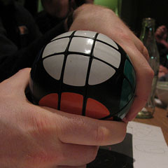
Sadly, I still get the feeling Away3d is a rubix sphere in a world of cubes. Slightly missunderstood, and seldom seen. However, once discovered you wonder why you’d never heard of it before! And fall for it’s smooth charm and slick good looks…
